Configuration
This section describes how to configure the module. Here we list all options in the Configuration Tab of the module settings.
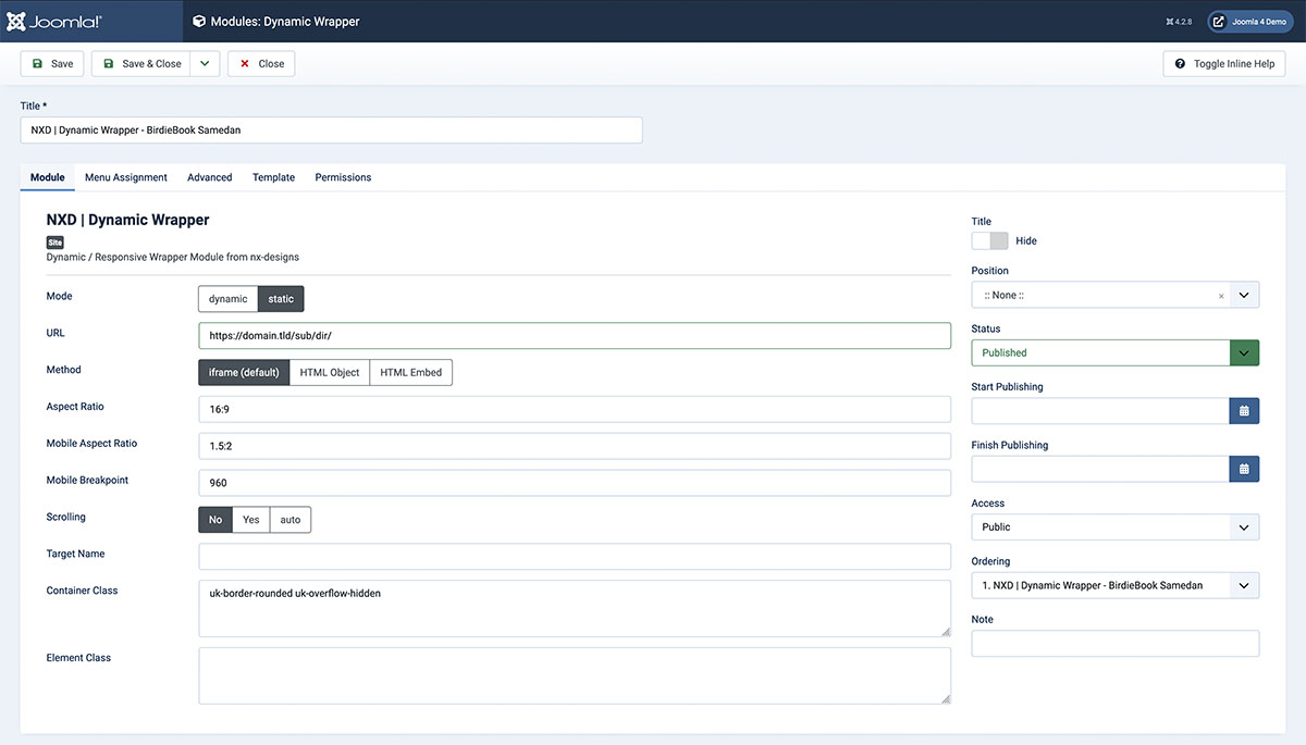
Options
Mode
There are two modes available:
- Dynamic: The content url source is loaded dynamically, you have to select a Customfield in the next option that holds the url.
- Static: The content url source is defined statically inside the module settings. You have to enter the url in the next option.
URL
This option is only available in Static mode. Here you can enter the url of the content source. You can either enter a full url or a relative url. Relative urls are relative to the Joomla root directory.
Customfield
This option is only available in Dynamic mode. Here you can select a customfield that holds the url of the content source. The URL inside the customfield can be either a full url or a relative url. Relative urls are relative to the Joomla root directory.
Method
Here you can select the method that should be used to implement the content source. The following methods are available:
- iframe: The content source is loaded inside an iframe.
- embed: The content source is loaded inside an embed tag.
- object: The content source is loaded inside an object tag. Please note that not all contents support all methods. If the content source does not support the selected method, try to use iframe.
Aspect Ratio
Here you can define the aspect ratio of the content container. The aspect ratio is defined as width:height. For example 16:9 or 4:3. Alternatively you can also enter the ratio as a decimal number. For example 1.78 or 1.33. This ratio will be used on large screens.
Mobile Aspect Ratio
Here you can define the aspect ratio of the content container on mobile devices. The aspect ratio is defined as width: height. For example 16:9 or 4:3. Alternatively you can also enter the ratio as a decimal number. For example 1.78 or 1.33. This ratio will be used on small screens. You can set the breakpoint in the next option.
Mobile Breakpoint
Here you can define the breakpoint where the mobile aspect ratio should be used. The breakpoint is defined in pixels. For example 768.
Scrolling
If the iFrame Method is used, you can define if the iFrame should be scrollable or not. The following options are available:
- Yes: The iFrame is scrollable.
- No: The iFrame is not scrollable.
- Auto: The iFrame is scrollable if the content source is larger than the iFrame.
Target Name
Define a name for the target window. This name will be used in the target attribute of the iframe tag.
Container Class
Define a class for the content container. This class will be added to the content container. You can use this class to style the content container. Multiple classes can be added by separating them with a space.
Element Class
Define a class for the content element. This class will be added to the content element. You can use this class to style the content element. Multiple classes can be added by separating them with a space.