Module Tab
Module Basic Settings
Exposer Mode
The Exposer mode defines the way the Exposer is used. The following modes are available:
- Joomla Articles: Exposer is used to display Joomla articles.
- Joomla Contacts: Exposer is used to display Joomla contacts.
Select Category
Select the category from which the articles / contacts are to be displayed. If no category is selected, Category filter is not used.
Filter by Tags
Select the tags by which the articles / contacts are to be filtered. If no tag is selected, Tags filter is not used.
Max Items
The maximum number of items to be displayed. If no value is entered, all items are displayed.
Show Subcategories
If this option is activated, the articles / contacts of the selected category and its subcategories are displayed.
Subcategory Level
The number of subcategories to be displayed. If no value is entered, all subcategories are displayed.
Sorting
The sorting of the articles / contacts. The following sorting options are available:
- Item Order: The order of the items in the category.
- Created Date: The date of creation of the item.
- Modified Date: The date of the last modification of the item.
- Publish Up: The date of the first publication of the item.
- Publish Down: The date of the last publication of the item.
- ID: The ID of the item.
- Title: The title of the item.
- Hits: The number of hits of the item.
- Random: The items are displayed in a random order.
- Customfield: The items are sorted by the value of a customfield.
Customfield
If the sorting is set to "Customfield", the customfield by which the items are to be sorted must be entered.
Order Direction
The order direction of the articles / contacts. The following order directions are available:
- Ascending: The items are sorted in ascending order.
- Descending: The items are sorted in descending order.
Layout
The layout of the Exposer. The following layouts are available:
- Grid: Exposer is displayed in a grid layout.
- Slideshow: Exposer is displayed in a slideshow layout.
- Simple List: Exposer is displayed in a simple list layout.
- List: Exposer is displayed in a UIkit list layout.
Created by
The user who created the articles / contacts. If no user is selected, the user filter is not used.
Featured Items
Select if Featured items should be displayed or not. The following options are available:
- Only: Only Featured items are displayed.
- Show: Show Featured items.
- Hide: Featured items are not displayed.
Dynamic Conditions
Available Conditions
The condition defines the condition under which the items are displayed. The following conditions are available:
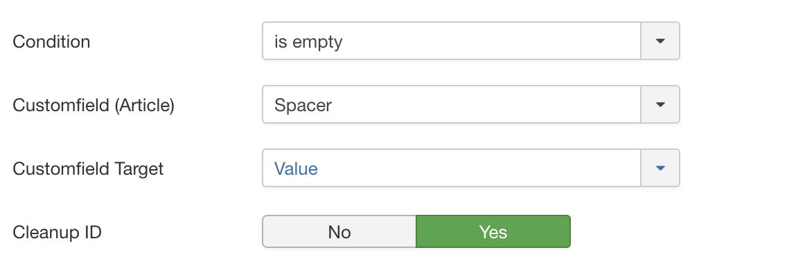
is empty
Checks if the value in the selected Customfield is empty. If the value is empty, the item is displayed. Select the Customfield in the "Customfield" field. Additionally, you can select if the Customfield Value or RAW Value should be checked.
is not empty
Checks if the value in the selected Customfield is not empty. If the value is not empty, the item is displayed. Select the Customfield in the "Customfield" field. Additionally, you can select if the Customfield Value or RAW Value should be checked.
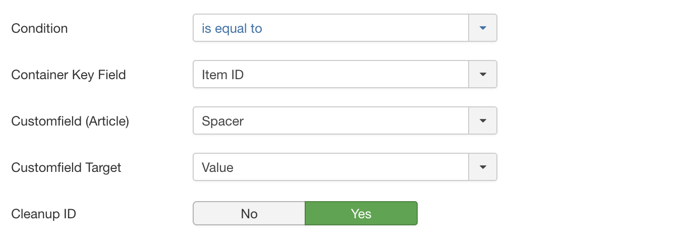
is equal to
Compares the value in the selected Container Key (Custom)Field (from the item where Exposer got placed in) with the value stored in the "Customfield" field of the articles. If the values are equal, the item is displayed.
is not equal to
Compares the value in the selected Container Key (Custom)Field (from the item where Exposer got placed in) with the value stored in the "Customfield" field of the articles. If the values are not equal, the item is displayed.
is less than
Checks if the value in the selected Container Key (Custom)Field (from the item where Exposer got placed in) is less than the value in the "Customfield". If the value is less than the value in the "Customfield" field, the item is displayed.
is same or less than
Checks if the value in the selected Container Key (Custom)Field (from the item where Exposer got placed in) is same or less than the value in the "Customfield". If the value is same or less than the value in the "Customfield" field, the item is displayed.
is greater than
Checks if the value in the selected Container Key (Custom)Field (from the item where Exposer got placed in) is greater than the value in the "Customfield". If the value is greater than the value in the "Customfield" field, the item is displayed.
is same or greater than
Checks if the value in the selected Container Key (Custom)Field (from the item where Exposer got placed in) is same or greater than the value in the "Customfield". If the value is same or greater than the value in the "Customfield" field, the item is displayed.
contains
Checks if the value in the selected Container Key (Custom)Field (from the item where Exposer got placed in) contains the value in the "Customfield". If the value contains the value in the "Customfield" field, the item is displayed.
does not contain
Checks if the value in the selected Container Key (Custom)Field (from the item where Exposer got placed in) does not contain the value in the "Customfield". If the value does not contain the same value in the "Customfield" field, the item is displayed.
Main Media
Image Source
The image source defines the source of the image. The following image sources are available:
- Do not display an image: No image is displayed.
- Customfield: The image is taken from a customfield.
- Article Full Image: The image is taken from the article image.
- Article Intro Image: The image is taken from the article intro image.
Customfield
If the image source is set to "Customfield", the customfield from which the image is to be taken must be selected.
Plugin Support
If your custom field is not the native media field of Joomla! (field type), you may need to enable plugin support to render the custom field correctly.
Load all Fields
Should all fields for which a content is available be loaded? If you have stored several custom fields (separated by ";") If no, simply the first field with content is rendered in the frontend.
Custom Fallback�
Custom Fallback for Customfields. If the Customfields setted up above are empty for an article use this source instead. The following image sources are available:
- Do not display an image: No image is displayed.
- Article Full Image: The image is taken from the article image.
- Article Intro Image: The image is taken from the article intro image.
Fallback Image
The fallback image is displayed if no image is available. Select the image in the "Fallback Image" field.
CSS Classes
The CSS classes are added to the image. Enter the CSS classes in the "CSS Classes" field. Multiple CSS classes can be
entered, separated by a space.
myclass1 myclass2
Container CSS Classes
The container CSS classes are added to the image container. Enter the CSS classes in the "Container CSS Classes" field.
Multiple CSS classes can be entered, separated by a space.
myclass1 myclass2
Title
Title Source
The title source defines the source of the title. The following title sources are available:
- Article Title: The title is taken from the article title.
- Customfield: The title is taken from a customfield.
Customfield
If the title source is set to "Customfield", the customfield from which the title is to be taken must be selected. Supports multiple fields separated by ";"
Title Tag
The title tag defines the HTML tag of the title. The following title tags are available:
- H1 - H6: The title is displayed in a HTML heading tag.
- Div: The title is displayed in a div tag.
- Span: The title is displayed in a span tag.
- P: The title is displayed in a p tag.
Title Alignment
The title alignment defines the alignment of the title. The following title alignments are available:
- Left: The title is aligned to the left.
- Center: The title is aligned to the center.
- Right: The title is aligned to the right.
Additional CSS Classes for Title
The additional CSS classes for title are added to the title. Enter the CSS classes in the "Additional CSS Classes for
Title" field. Multiple CSS classes can be entered, separated by a space.
myclass1 myclass2
Text
Text Source
The text source defines the source of the text. The following text sources are available:
- Article Intro Text: The text is taken from the article intro text.
- Article Full Text: The text is taken from the article full text.
- Customfield: The text is taken from a customfield.
- Do not display text: No text is displayed.
Customfield
If the text source is set to "Customfield", the customfield from which the text is to be taken must be selected. Supports multiple fields separated by ";"
Remove HTML
Should the HTML tags be removed from the text? If yes, the HTML tags are removed from the text.
Truncate to
The text is truncated to the number of characters entered into the Truncate to field. If the text is longer than the
number of characters entered into the Truncate to field, the text is truncated and an ellipsis is added to the end
of the text. Please note that the text is truncated to the nearest word or the end of a sentence (by searching
for ., ! or ?) if possible. If the senctence has ended naturally no ellipsis will be added. If the text is
shorter than the number of characters entered into the Truncate to field, the text is not truncated.
Container Tag
The container tag defines the HTML tag of the text container. The following container tags are available:
- Div: The text is displayed in a div tag.
- Span: The text is displayed in a span tag.
- P: The text is displayed in a p tag.
- H1 - H6: The text is displayed in a HTML heading tag.
Content Alignment
The content alignment defines the alignment of the text. The following content alignments are available:
- Left: The text is aligned to the left.
- Center: The text is aligned to the center.
- Right: The text is aligned to the right.
Additional CSS Classes for Content
The additional CSS classes for content are added to the text. Enter the CSS classes in the "Additional CSS Classes for
Content" field. Multiple CSS classes can be entered, separated by a space.
myclass1 myclass2
Meta
Meta Source
The meta source defines the source of the meta. The following meta sources are available:
- Article Title: The meta is taken from the article title.
- Customfield: The meta is taken from a customfield.
- Not used: The meta is not used.
- Author: The meta is taken from the article author.
- Date created: The meta is taken from the article date.
Customfield
If the meta source is set to "Customfield", the customfield from which the meta is to be taken must be selected. Supports multiple fields separated by ";"
Truncate to
The meta is truncated to the number of characters entered in the "Truncate to" field. If the meta is longer than the number of characters entered in the "Truncate to" field, the meta is truncated and an ellipsis is added to the end of the meta.
Position Meta
The position meta defines the position of the meta. The following position metas are available:
- Above Title: The meta is displayed above the title.
- Below Title: The meta is displayed below the title.
- Below Text: The meta is displayed below the text.
Additional CSS Classes for Meta
The additional CSS classes for meta are added to the meta. Enter the CSS classes in the "Additional CSS Classes for
Meta" field. Multiple CSS classes can be entered, separated by a space.
myclass1 myclass2
Category
Display Category Name
Should the category name be displayed? If yes, the category name is displayed.
Position Category Name
The position category name defines the position of the category name. The following position category names are available:
- Above Title: The category name is displayed above the title.
- Below Title: The category name is displayed below the title.
- Below Text: The category name is displayed below the text.
Additional CSS Classes for Category
The additional CSS classes for category are added to the category name. Enter the CSS classes in the "Additional CSS
Classes for Category" field. Multiple CSS classes can be entered, separated by a space.
myclass1 myclass2
Customfields
Customfields Source
Define which Customfields should be displayed. Multiple fields separated by ";"
Customfields Container Classes
Enter the CSS classes in the "Customfields Container Classes" field got mapped to the container element. Multiple CSS
classes can be entered, separated by a space.
myclass1 myclass2
Customfields Classes
Enter the CSS classes in the "Customfields Classes" field. Multiple CSS classes can be entered, separated by a space.
myclass1 myclass2
Display Customfields Label
Should the label of the customfield be displayed? If yes, the label of the customfield is displayed.
Fields Position
The fields position defines the position of the customfields. The following fields positions are available:
- Above Title: The customfields are displayed above the title.
- Below Title: The customfields are displayed below the title.
- Below Text: The customfields are displayed below the text.
Link Setup
Link Type
The link type defines the type of the link. The following link types are available:
- Not used: No link is displayed.
- Full: The full item is linked.
- Button: The link is displayed as a button.
Link Mode
The link mode defines the mode of the link. The following link modes are available:
- Link to Article: The link is linked to the article.
- Modal: The link is displayed in a modal window.
Hyperlink Target
The hyperlink target defines the target of the link. The following hyperlink targets are available:
- Self: The link is opened in the same window.
- Blank: The link is opened in a new window.
- Parent: The link is opened in the parent frame.