Hub Items
This Section of the Settings is to style the Hub Items. The Hub Items are the elements that are displayed in the Hub.
Options
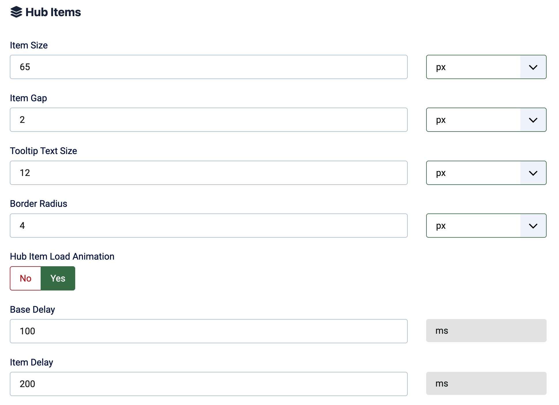
Item Size
Define the size of the Hub Items. The size can be set in Pixels, em, or rem.
Icon Size
Define the size of the Icons in the Hub Items. In the Free Version, yo get the standard fa-2xs to fa-2xl sizes. In the Pro Version you can select from 18 predefined sizes from 0.625em up to 10em (fa-2xs to fa-10x).
Item Gap (Spacing)
Define the gap between the Hub Items. The gap can be set in Pixels, em, or rem.
The gap is the space between the items and will also be applied as space between the items and the content.
Tooltip Text Size
Define the size of the Tooltip Text. The size can be set in Pixels, em, or rem.
Border Radius
Define the Border Radius of the Hub Items (The first and last item's outter corner). The Border Radius can be set in Pixels, em, or rem.
Hub Item Load Animation
Select wehther the Hub Items should be animated when they are loaded or not, if enabled you can then define Base and Item Delay.
The Load Animation is only available in the Paid Version.
The Load Animation always is a "Slide In" Animation from the side where the Hub is aligned.
Base Delay
If the Load Animation is enabled you can define the Base Delay here. The Base Delay is the time in milliseconds that the first item waits before it starts the animation.
Item Delay
If the Load Animation is enabled you can define the Item Delay here. The Item Delay is the time in milliseconds that each item waits (after the first one) before it starts the animation.
The Colors of the items are described in the Colors Section.